Interior Designer to rescue a living room on the Upper East Side
I designed this living room for a young twosome who have lived in this rental for the last many years. The living room was large and they had specific needs but it was mix of inefficient layout and out of scale furniture which made the space dysfunctional.
As always, I started at the drawing board, creating defined spaces to suit their daily life. I kept the color pallete light and airy with lots of natural material layered in with pops of color and pattern. For the first time maybe, I started my design with a rug, bringing in colors, geomtery and some abtract coolness. Photography by Daniel Wang.
This living room is nice and big and I wanted to create that sense as soon as you walk into the apartment. In the bay window I created an intimate seating area while still keeping it pat of the main room. The sofa is generous in size and comfort, modern and simple. I love the eased arms and how they bring such a soft detail to the space. The side tables are 100% solid marble and weigh a ton and look stunning with the beautiful vening. I kept the art rectangular and the lampshade taller to make standard ceiling heights appear taller. The media cabinet is a beautiful natural oak with a polished marble top. A touch of greenery and its a homerun.
I wanted to treat the bay window special. By painting it a darker grey, I highlighted the space, but by placing the cairs at an angle, they become part of the main space and an extention. The plants and flowers bring in cheeriness while the patterned pillows are a fun accent. This is a special space in this home, kind of like a retreat in itself and placed in a previously wasted space.
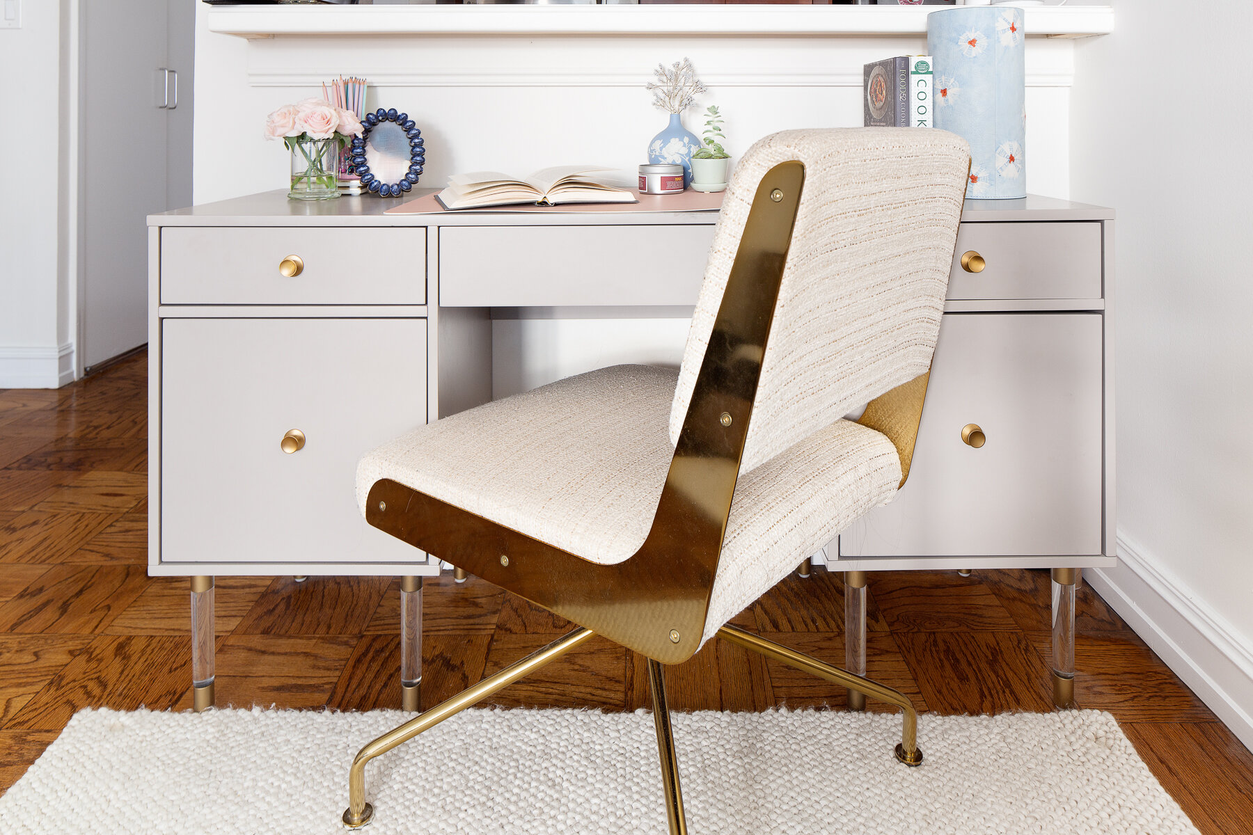
Work from home has been the governor’s command since March and boy did this desk get used!! We shot it only now, but my client has been busy working and crafting on this generous deask compared to the small station she had for herself earlier. When you are home and can work in a good environment, work feels nicer!! We love the brass details on the chair and the desk with those acrylic legs. Some blush accessories and this is a home office fit for a girl boss!!
More function upon entering this space… the usual perch for keys and airpods but also a wall clock to keep track of time as you binge watch season after season in these pandemic days!!
Styling shot of this beautiful vignette… The marble side table, the shadow playing through the vases and the perfect softness of the tulips, make this living room corner one of favourites from this project!!


